The Kinrave brand.
A stamp, a split letter and three colours taken from a warehouse at 4am. Use these files as they are.
Logo



The K
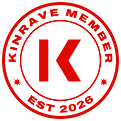
A bar and a chevron that point at each other and never touch. Two parts, one letter: the vocalist and the producer, meeting in the gap. Leave the gap open; never join the strokes.
The stamp
Every member is stamped in, like the door of a club. The stamp carries the member number and appears on profiles, releases and anything we send. It always sits a little crooked, as a real stamp would.
Colour
Red marks what you can act on and the stamp. Nothing else is red. Red text goes on black only at 24px and above.
Type
Archivo
One typeface, two settings. Headlines use Archivo at full width and black weight, tracked tight. Reading text uses the same family at normal width, 18px and up.
Make it together. Get paid for all of it.
Voice
Say what happens
"Tell me when Vox opens", not "Subscribe". Buttons name the result.
Talk like the scene
Kin, stamp, set, split. Plain words people already use in the booth and the studio.
No hype numbers
We never promise streams, amounts or virality. We show what we can check.
Side with the artist
When something is unfair to artists, we say so plainly and build the fix.